Understanding the Problem
People don't fail to get support because the information doesn't exist — they fail because it's scattered, jargon-heavy, and offers no sense of where they are in the process. This holds true whether the process is a carer's assessment, a planning consent application, or an EPR compliance deadline. The problem isn't domain-specific. It's structural.
Context
- Origin: SEN Navigator, built to help parents through the EHCP process — where the step-based, colour-coded, low-cognitive-load format was pressure-tested first
- See the SEN Navigator case study for the origin work, including the iterative remixes that got the format to hold
- Nav Suite is the generalisation test — the same shape pointed at ten other processes to see if it survived contact with genuinely different problems
Research InsightThe barrier to support is usually structural, not informational. Fix the shape of the journey and the domain content mostly falls into place.
How I Tackled It
A format only counts as validated once it's been thrown at enough unrelated problems to stop being a coincidence.
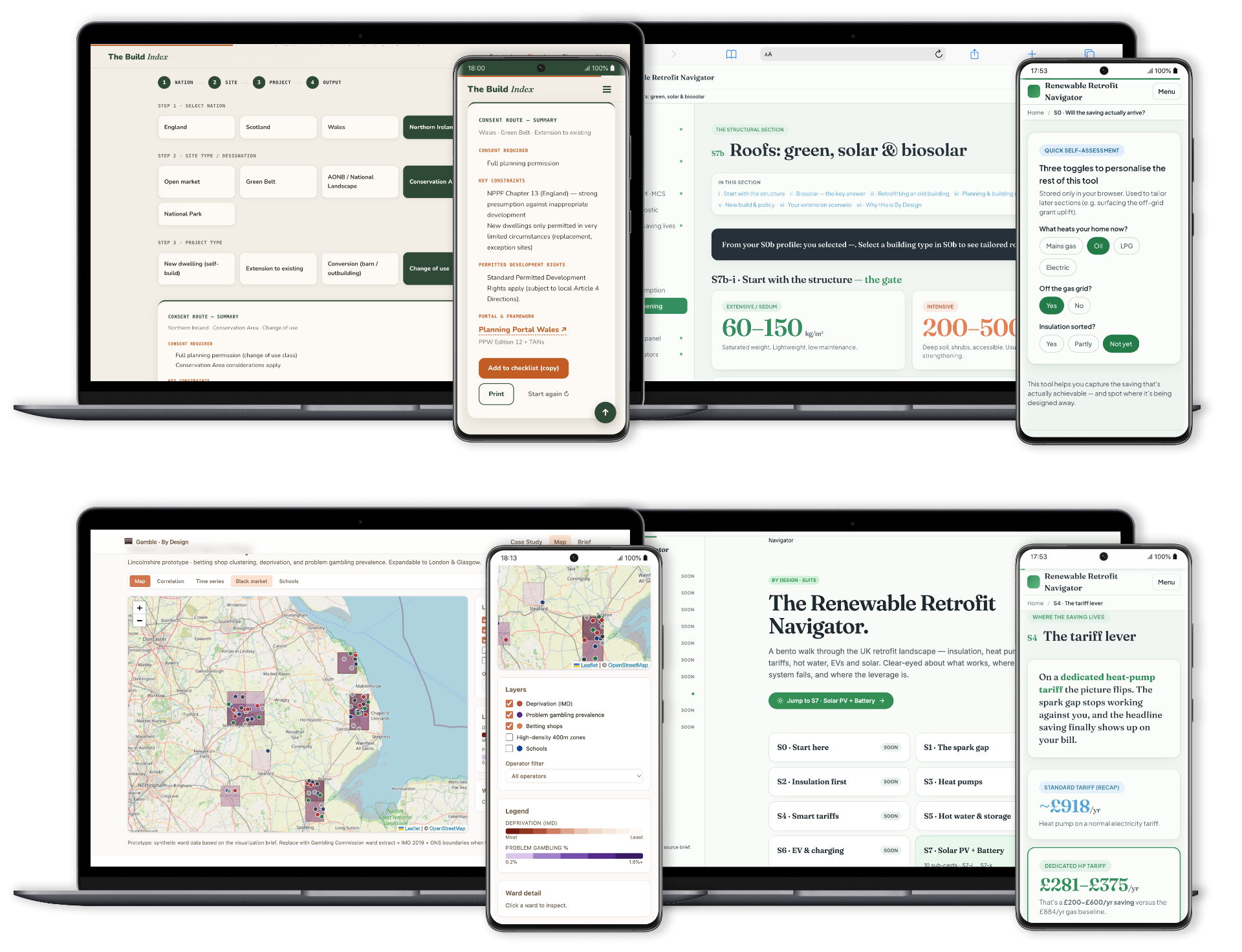
One skeleton — numbered steps, consistent token structure, swappable content — deployed across eleven unrelated domains. The craft question wasn't 'how do we design a navigator': that was answered once. The real question, asked eleven times, was whether the shape survives contact with a genuinely different problem.
Key Decisions
One step at a time, always
Never the whole process at once. Each screen surfaces only the current step and what to do about it.
Why: Cognitive load is the thing that breaks navigation of institutional processes — not missing information.
A distinct colour per stage
Location in the journey is felt, not just read. Colour identity is load-bearing, not decorative.
Why: People need a felt sense of where they are before they can absorb what comes next.
Self-contained and embeddable
No dependency on a host site's design system. Each navigator ships with its own tokens and works standalone.
Why: Institutional hosts change; the navigator can't fall apart when it does.
WCAG 2.1 AA as a floor
Accessibility baseline is the starting point, not an aspiration to reach later.
Why: The audience for these tools is disproportionately people already navigating friction; the format can't add to it.
Built and tested rapidly in Lovable — each navigator a fast, disposable prototype rather than a finished product. Community energy information behaves nothing like EPR packaging compliance. The navigator format didn't care.