Understanding the Problem
Plant managers needed real-time quality control, OTIF, and CO₂ at a glance — but existing dashboards were built for HQ, not the factory floor. Managers couldn't get insights without stepping away from the line. Decisions were delayed, metrics were stale.
Context
- Manufacturing operations across 3 facilities (Southeast Asia)
- Operations teams managing 40–50 shipments/day per facility
- Compliance: OTIF tracking, quality audits, emissions reporting
- Existing tools: fragmented dashboards, manual checklists, spreadsheets
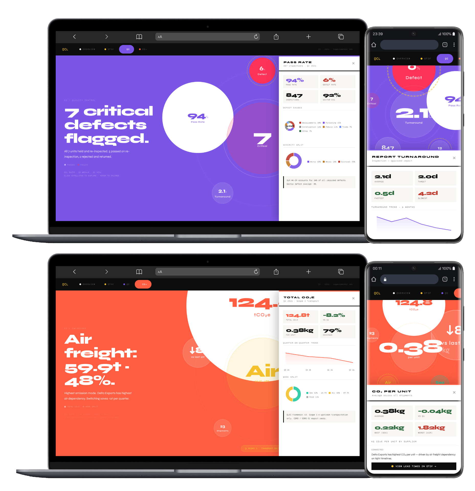
QCL — Main dashboard
Glanceable, task-tier operations surface designed for the line.
QCL — Main dashboard
Glanceable, task-tier operations surface designed for the line.
QCL — Main phone app
Mobile companion for floor operators — inspections in the palm of your hand.
Research InsightPhysical workflows teach interface design. I spent a week on the line with operators and managers. What I learned: they don't need more data — they need the right decision at the right moment. A manager doesn't check a dashboard when a shipment fails QC; they need to know 'what do I do about this shipment right now?' The interface should guide the action, not show the data.
How I Tackled It
Operational intensity is beautiful when clear. Complex systems don't need to feel chaotic — they need good information design and task-first navigation.
A glanceable ops surface with task-tier escalation, gloves-on interactions, and metric-to-action paths in two taps.
Key Decisions
Task-Tier Escalation
Routine checks live in the background (green). Escalations surface prominently (orange). Critical issues demand attention (red). Colour-coded task hierarchy, not a sea of metrics.
Why: Operators have 30–40 metrics to track. My job wasn't to show all 40 — it was to show 'here's your action right now' and surface context only when needed.
Gloves-On Interactions
Touchscreen UI designed for gloved hands. Buttons 48px+. No hover states. Voice-input capable for common tasks.
Why: Operators work with heavy gloves on. UI can't assume fine motor control. I tested with actual work gloves.
Metric-to-Action Paths
Every metric has a clear next-step if it fails. QC flag? Show the rework workflow. OTIF slip? Show the acceleration options.
Why: Data without action is just noise. I tied every metric to its decision point.
I spent 2 weeks on-site, timed actual workflows, identified decision moments, and designed the interface around those moments — not around a generic dashboard template.