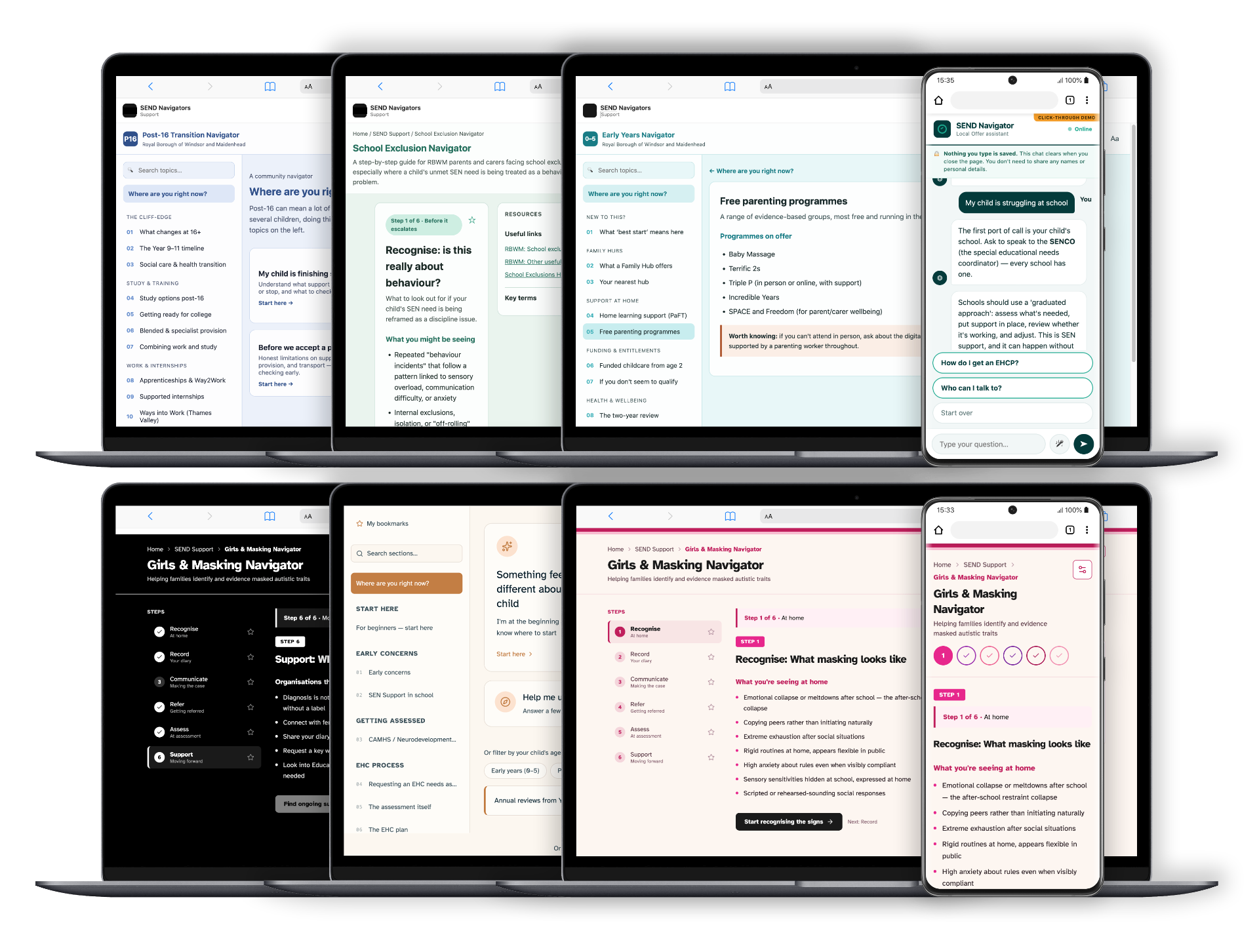
Understanding the Problem
SEND parents face overlapping systems (health, education, social) — each with different language, timelines, and rights. No single place explains how they connect. Families spend 30+ hours researching, missing deadlines, losing money because they don't know what they're entitled to.
Context
- UK SEND support system: 4 separate agencies, no integrated documentation
- Parent burden: advocate for their own child across all 4 systems
- Caseworkers at charity spending 6+ hours per family explaining the system
Research InsightAccessibility is clarity. When I tested plain language explanations with SEND parents, something unexpected happened: non-SEND parents also found them clearer. The features I added for accessibility — plain language, linear navigation, explicit timelines — made the system easier for everyone.
How I Tackled It
Accessibility is clarity. Plain language, clear structure, explicit connections — these are universal principles.
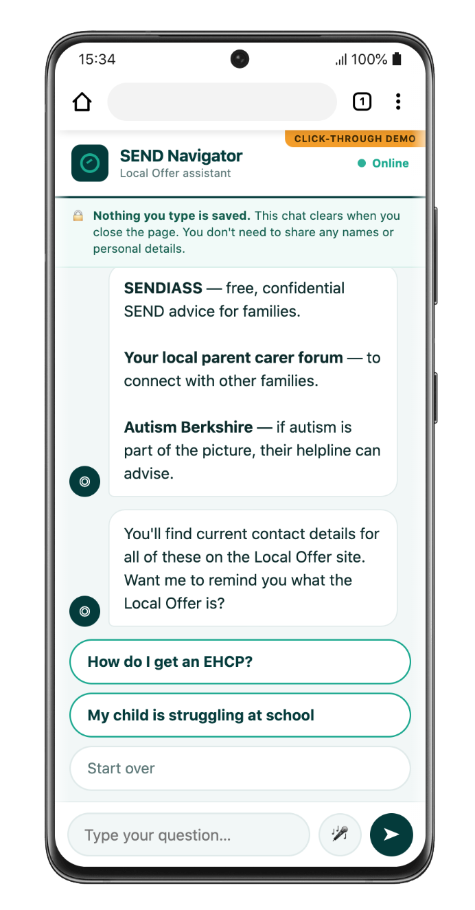
A plain-language navigator that maps a family's situation to their next viable step, with accessibility built into the substrate, not bolted on.
Format Origin
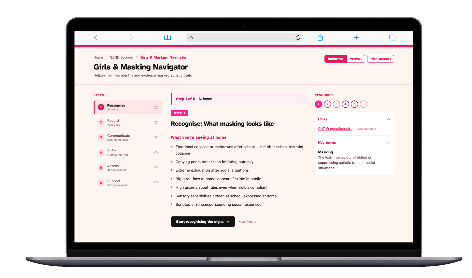
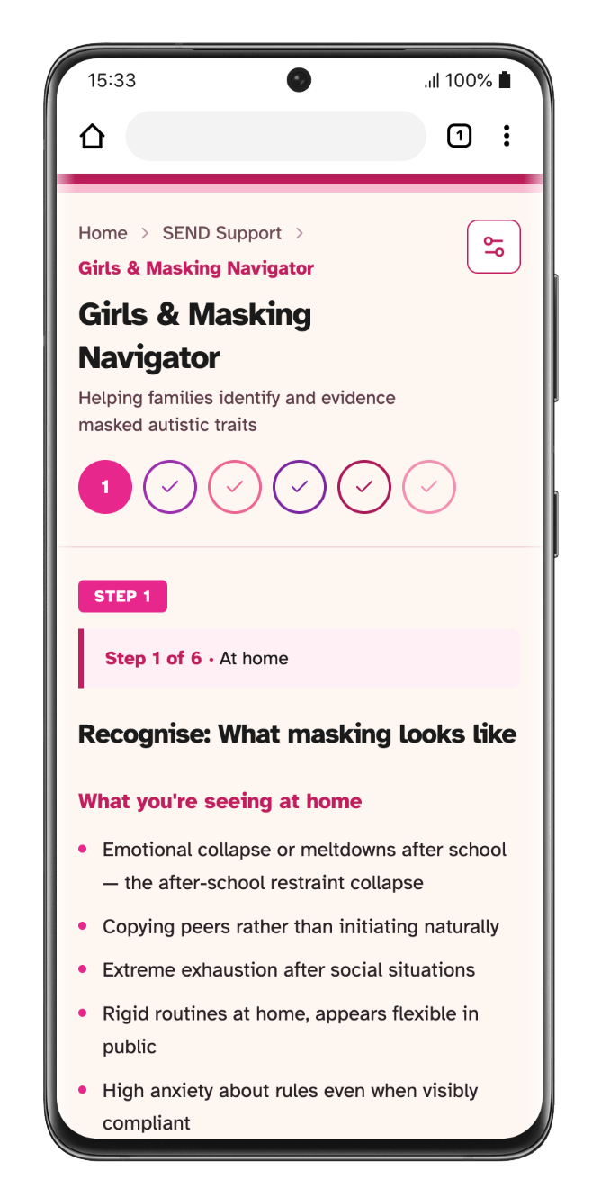
This step based, colour coded structure was built first for a Girls and Masking Navigator, then carried into every other navigator in the suite.
Key Decisions
Situation-Based Navigation
Not a linear flow. Questions map to a family's actual situation: 'Are you in assessment?' 'Do you have an EHCP?' The system then shows their next viable step.
Why: SEND parents read pages of irrelevant guidance before finding the 1 paragraph that applied to them. I inverted it: 'Here's your situation. Here's your next step.'
Plain Language + Explicit Timelines
Every process explained in plain English with exact timelines. 'EHCPs take 20 weeks. You'll get a draft in week 16. You have 15 days to respond.'
Why: Families lose money and entitlements because they don't know timelines. Making them explicit up-front is a massive burden reduction.
Accessibility Built In, Not Bolted On
Plain language, dyslexia-friendly font, sufficient contrast, clear hierarchy, voice input from day one.
Why: SEND is intersectional. Families dealing with complex bureaucracy often also have processing challenges. Design needs to work for them first.
I conducted 30+ interviews with SEND parents and caseworkers. Mapped the actual system (which processes come first, which can overlap, what deadlines matter). Built a decision tree, tested it with parents navigating real scenarios, and refined the copy through rounds of accessibility testing.